Sunday, 15 November 2009
Task 1

Task 2
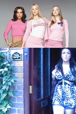
The character we decided to look at was the "Fake". We have compared her to the "Plastics" in the film 'Mean Girls' The similarities the characters have are the way in which they dress , for example in these images all characters are dressed in short skirts and caked in makeup, giving of the impression of 'Plastic'. However in this shot due to fading and lighting you can not see the extent of makeup our character is wearing.
All characters also have similar roles in the films, they pick on people who are vulnerable and they set all the trend, However no one really likes them they just scare people into liking them.
Below also is an example of the geek character and a similar character to her from the film `A Cinderella Story`.
Task 3
A production company is in charge and responsible for the growth of the product, and also the psychological part of production of a product. In a lot of cases it is common for the production company to raise and/or give funds to go to the product.
Where does the money come from?
A lot of the time the money comes from the production company, or for some low budget productions the money is sponsored e.g: for an independent film. A good option for mine and Emma's film would be "The UK film councils print and advertising fund", this is because our film would come in the category of a "low budget" production. Another option for us would be to be entered in such competition's where you are funded money to go towards the product, the best product out of many would be chosen to be casted, an example of this could be "the microwave challenge" this is supported by the BBC.
Idea of a Distributor?
Warner Brothers could be a good distributor for our product, this is as it was the distributor to "A Cinderella story". However we could also have the distributor of "Sony Productions", which is the distributor for "The House Bunny" which is a recent well know film.Paramount Pictures is the distributor for the film "Mean Girls", this is a very well know distributor and has a lot of films that our in the same typical genre of our film, in which makes me believe this would be the best distributor to have for our film production.
The titles?
The first titles that appear in our film opening our the two actresses who play the roles of the two main characters. The titles both come in after the characters are shown E.g: The "Geek" comes on screen, then the title will come up of who's playing that part, which in this case "Emma Smart" comes up. At the end of our film opening the titles of the producers and directors come up, this is as it will stick in the audiences mind. The main title which is of course the film's name "Queenbees and Wannabees" comes up in the middle of the opening this is to break up whats going on and gives a sense of presents of the title. We also have other titles in or film opening such as the Cinematographer to make sure praise is perceived.
What Film is similar to it institutionally?
There are many films that similar to our film such as "Clueless" and "Another Cinderella Story", this is because they are both in a school atmosphere and setting which is the same as mine and Emma's product. "Mean Girls" and " A Cinderella Story" our also very similar to ours, this is as not only that they both have a school/college atmosphere, but also have the same aged characters as ours and would appeal to the same age group. "Angus thongs and Perfect Snogging" relates to ours as it has a "fake" in the film who is know as "Slaggy Lindsey", it also has the typical "Geek" who is know as "Georgia" she is know for always getting everything wrong but not on purpose. The T.V show "Beauty & the Geek" also relates to our film opening as it has strong compassion's in it like ours does.
Task 4

These are the type of people who would like to see our film.
They are between the ages of 13 and 19.
They could be Boys or Girls, but most likely Girls.
They spend their spare time hanging out with their friends, going to party's, going shopping, and watching films.
They are in full time education.
They listen to all types of music, but mainly mainstream music such as the top40.
They dress in Topshop/Topman, River Island, Primark and H&M.
They watch Hollyoaks, Big Brother, Skins, The Hills etc..
The girls enjoy sleepovers with their friends and the boys like playing football.
They spend their money on nights out with their friends or boyfriend/girlfriend and going to the cinema etc..
The main types of films they watch are teenage films as they can relate to them they also watch horror films and comedy's.
Task 5
Above is a Above is the annotated version of our film with annotations.
Here are some more points linking to similar films and places where our viewers would shop.
The first the scene of our film opening already relates to our target audience, this is because it is in the charts music that is playing, and so our target audience will like this as they will be able to relate to it because it is one of the latest trends of music. The music also tells the story of whats going on in the film and so many of our audience will be able to relate to the lyrics of the song because it has elements of school in it, also it highlights what would be seen as a typical teenage problem at school.
The next scene introduces the character of the "Geek", the costume design makes the character, as the big frame glasses give the element of typical geeky-ness. Our audience may be able to relate to this as they may know people who are like this, or they may be following the "geek sheek" look which is talked about in magazines such as Look magazine and Elle, these magazines appeal to our target audience.
The clip of the "Fake" looking in the mirror brushing her hair, is similar to a clip in the film "Mean Girls", this is where the main character Katy is looking in the mirror putting lip gloss on. This would draw the audience in as our audience would be interested in films which are like "Mean Girls" which is a typical chick flick.
The scene after that shows the character of the "Fake", the costume design also is the element that makes the character with the long socks and heels. This also relates to certain magazines with the glamor look Incorporated in it, such as Cosmopolitan magazine.
Perfume in our film opening is used as a prop to relate to our target audience. this is because the viewers who view our film our interested in the latest trends which include the latest perfumes. The perfume which is seen in our film opening is quite a well know product "Paradise" but it is also low priced, so will appeal to our audience as they would not be able to afford the top notch perfume brand.
Nail Varnish is used in our film opening in which can be purchased from Superdrug or Boots, which is where make up products are sold, these are shops were our viewers would shop to get there vanity products. The tippex in our shot also relates to the viewers as it relates to school life.
Task 6
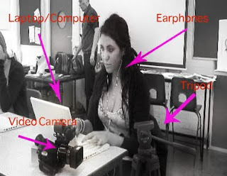
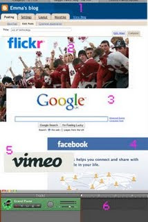
 1. Blogger, This was used to upload all of our pre planning.
3.Google, we found images and sites from this.
4. Facebook, We got inspiration and images for pre planning from this.
5. Vimeo, All of our videos were uploaded here.
6.Garageband, where all of our soundtracks were edited/made.
Task 7
 This is an example of where we used The Continuity Rule in both tasks
Looking back at our preliminary task and now looking at our final project, you can see how much we have progressed especially in editing. We can tell that we have defiantly improved on the match on action rule, this is where you join clips together to make one scene. We can see a difference in how we edited our preliminary to our film opening, this is as some of our scenes were cut to early and didn't have transitions to let the shots run through smoothly and not suddenly jump from one scene to another.
Wednesday, 4 November 2009
Creative Risks
Thursday, 29 October 2009
Tuesday, 27 October 2009
Our RoughCut
L3 - GROUP 2 (Hannah & Emma) Film Opening Rough Cut from cmdiploma on Vimeo.
I do realise we still have a lot of work to do, for example we need to put titles on our opening. We also need to put our extra footage in the sequence, this is why we have left a blank bit in our opening so far, and this is as this is where the footage will go. However I think the soundtrack we have chosen works really well with what we have created so far. The shakiness of the shots is to create the fill of real life; also it is to add a comic effect. I also believe the shot of Emma in the mirror works really well, we deliberately over did the so-called “geek” look to add humour to our film opening. I am pleased with how our work as turned out so far, and am looking forward to sharpen it up.
Feedback for Liam and Tom :D
L3 - GROUP 3 (Tom & Liam) Fim Opening Rough Cut from cmdiploma on Vimeo.
Monday, 26 October 2009
Film Categorization.
I think that our film should be classified as a 12A.
The A stands for 'accompanied' and 'advisory'. '12A' means that anyone aged 12 or over can go and see the film unaccompanied. Children younger than 12 may see the film if they are accompanied by an adult (e.g. someone over the age of 18), who must watch the film with them.
The content of '12A' rated films is suitable for children aged 12 and over, but i would not recommend taking young children to see them. The films may upset children under 12 or contain material which many parents will find unsuitable for them. An adult may take a younger child if, in their opinion, the film is suitable for their child. responsibility for allowing a child under 12 to watch the film at hand is up to the accompanying adult.
A quote from the BBFC concerning the age guidelines for a 12A: "the BBFC considers the content of '12A' rated films to be suitable for children aged 12 and over, and we would not recommend taking very young children to see them."
Their may be language used in the film but it must be infrequent and mild. The BBFC said :"The BBFC's Guidelines state that there may be strong language (e.g. 'f***') at ‘12’ or ‘12A’, but it must be infrequent."
Moderate violence can be seen in the film but, "it should not dwell on detail. There should be no emphasis on injuries or blood, but occasional gory moments may be permitted if they can be justified by their context (for example brief sight of bloody injury in a medical drama)."
The creative risks that our group took for our film opening are the style of our opening.
Our film is comical and it is a creative risk as our audience may not agree with our style of comedy and it could seem offensive to people who we base our characters on.
This could cost us because it could make our footage come across as offensive to some viewers. The Benefit of the creative risk we took is that the comedy comes across as funny to most viewers and therefore benefits us.
Monday, 19 October 2009
My Favourite shot so far.
Sunday, 18 October 2009
films in common with our film opening
Shooting so far.
Sunday, 11 October 2009
Moving Story Board
L3 Group 2: HANNAH & EMMA - OPENING SEQUENCE ANIMATIC from cmdiploma on Vimeo.
This is mine and emmas moving story board. we did this so we could work out a title sequence for our film opeining. However on this story board we have created you can not see the titles clearly as the colour blends in with the background. also we added the music that we are planing to use in out opening ( playing it through an i-pod). We also stopped the music at certain part in the story board, this is because we plan to do this in our film opening.
My Ident Final
Hannah's logo from cmdiploma on Vimeo.
I created this by using photo shop and final cut. I decided to use the name “ SEE BIG PRODUCTIONS” This is because I felt it would fit in with any sort of range of productions. I then got images that I thought would relate to the name, in which I came up with an eye to relate to the “see” in the name. I thought this would be effective. I then made a mock up of how I would like my logo to look in which I did this on photo shop arranging where to put the text and image. I decided to have a plan background to make it look more professional and used just one bold image to make it stand out.
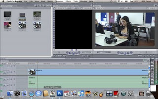
I then uploaded my image on to final cut where I set the text and image to do certain transitions, for an example I made the eye suddenly grow. I think the growing of the eye was effective, however I think the the text may be a bit plane, however it makes it original.
Tuesday, 6 October 2009
Mind Frames
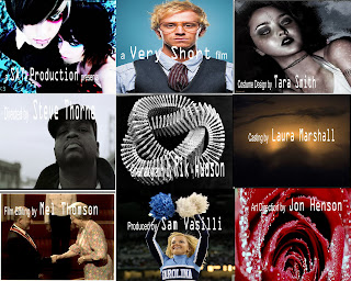
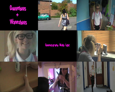
Emma and I created this mind frame. we used a collection of images to see what looked intressting and effective, also to see what stood out. However as you can see we realised that the color of the font is a big problem as in some of the frames you cannot read it, for an example frame 4, you cannot read the text as the background color is too simlare to the text. This taught as that we have to be aware of not only the text but the image. However i belive that the text on frame 6 stands out and looks quite effective.
Film Pitch
Monday, 5 October 2009
My logo
Casting Crew list
A See Big Production film
(cast) Adam Elliott
(cast) Oliver Johnson
(cast) Robert Walker
Costume Design by Hayley Amin
Art Direction by Sophie Maguire
Production Design by Yaz Murr
Casting by David Watts
Film Editing by Charlotte Andrews
Cinematography by Molly Light
Original Music by Tilly Wright
Produced by Hannah Amin
Directed by Emma Smart
Sunday, 4 October 2009
Friday, 2 October 2009
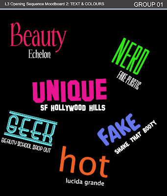
Mood board-text
Mood board
Thursday, 1 October 2009
Film Briefs
ACTION:
Harry regular teenage boy has seen a robbery take place. He then takes the wrong path in which he starts to help out in robberies. however a group of gangsters find out about the robberies and hunts harry down.. will he turn a new leave or carry one with his bad ways?..
SUPERNATURAL THRILLER:
A woman starts hearing voices everyday,the voices always seem to come to her when she's in her bathroom. She starts to see things which leads her to do dangerous and life threatening things. will she realize the message to the voice?..
INDEPENDENT:
A young girl gets caught up in the way of life of girl world, she ends up not being able to handle it all and so turns to drugs, will she kick the habit and go back to her normal lifestyle?
ANIMATED FATURE:
A young male commits a supposed suicide. Many are getting questioned about it, they all have their alibis. The case of the suicide gets followed up and the detective finds death threats being thrown at him.. Was it a murder or a suicide? Will the detective get out alive? ..
Wednesday, 30 September 2009
Preliminary exercise
The shot/reverse rule:
This is where the camera shows each character when talking, for an example this was used in our preliminary exercise. We used the 180-degree rule when the camera filmed me when talking to Emma, then the camera swapped sides and filmed Emma when talking to me. These shots were done over the shoulder.
The match on action rule:
This is when you join different shots together to make one scene. For an example our group did this, this was used when I opened the door then a different shot showed me walking through the door, in which created one fluent scene.
180-degree rule:
This is when filming you can only go on a 180 degree axis. This is to prevent unfocused shots; it also makes sure the qualities of the shots are up to standards.
In the preliminary exercise I believe that Emma and I did fairly well editing the film. However we did come across some problems, this is as at first our sound track was not working properly in which we had to start again. Also we found it slightly difficult to cut the scenes in the right places, as you can see we have cut the scenes to early in which it goes to quick or goes jerky. Also I noticed that we forgot to take out the very beginning bit of sound as it has Elliott talking in it, however this is not too difficult to sort out. However with our faults I think we did fairly well, this is as we worked well as a team and also in the end our preliminary exercise turned out quite well.
Monday, 28 September 2009
Feedback
Film Opening
INSTITUTIONAL INFORMATION:
The Distributor “A Compass International Pictures” of Halloween is clearly stated in the film opening, this is the first credit that comes up, as its one of the more important credits. The production of this horror film is a Debra Hill production, which is also clearly stated in the credits. The studio were Halloween was filmed was Starz / Anchor Bay however this is not stated in the film opening.
JOB TITLES:
The producer of Halloween is John Carpenter this stated near the very beginning of the opening. The director is also John Carpenter. The film editors were Tommy Wallace and Charles Bornstein. John Carpenter was also the music director. The stars of the film are shown fairly soon in the credits, the stars are Jamie Lee Curtis staring as Laurie, Nancy Looms staring as Annie and P J Soles as Lynda. Dean Cundey is the director of photography. The screenplay/writer was also John Carpenter again and Debra Hill. As you can see from this John Carpenter did a lot for his own film.
MUSIC:
The music playing in the background of the opening sets the tone and mood of the film, the music is such a strong element in the opening in which the actual titles on show didn’t have to be so bold, as the music was setting the scene and putting the audience on edge. This music creates all the atmosphere as it is very trippy and makes you think something bad is going to happen even in the opening scene. It gives an element of knowing that film is going to be a thriller.
MAIN CHARACTER INTRODUCED:
The main character is introduced on the sixth credit, the actress (Jamie lee Curtis) who plays the main character is in bold, this is so the audience immediately looks straight to the name of the actress, without them knowing it. There is not too much being shown as the music makes the whole thing come together as one, so there was no need for any fancy business.
INTRODUCTION TO ACTION/STORY:
There is not an introduction to the story in the opening, other than the title of the film “Halloween”. However like I said the music in the opening shows the audience that the film is going to be a horror.
SOMETHING TO CAPTURE AUDIENCE INTEREST:
The music captures the audience interests it is very heart racing. Also the colour changing titles in the opening captures the audience, as it is something interesting to look at, rather than just looking at one plan colour. Another thing which captures there audiences interest is the pumpkin as it starts moving closer and closer to the screen, so in the end all you can see is the light of the pumpkin, which sets of the reaction of the unknowing.
Sunday, 27 September 2009
Juno :)
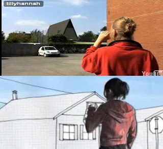
These are still shots of the actual Juno opening and mine and Tilly’s opening of it. I think we did this scene quite well as they are very similar.
This is our remake of the beginning of Juno. The first task was to create storyboards of what’s happening in the beginning, we also had to time each scene to make sure it was accurate timing when filmed, as we wanted it as similar to the film as possible. The first thing I noticed when filming was that it wasn’t going to be as easy as it looked to do. There were a few problems filming this, this is as some of the shots were tricky to do, for an example the helicopter shot, in which we had to keep re-taking that shot to get it right. Also finding the right location was also quite difficult, as we were not allowed off site, in which we had to make alternative shots for scenes, such as the lamppost scene we change the lamppost in to just a normal light, as there was not a lamppost on site.
The next step was to edit our filming on the Macs. Tilly and I edited I, however we found it quite tricky to make the music fit in with the scenes, in which ended up having to put the music on slow motion. Also I notice that we had cut the first scene to early as we missed me acting as a runner run past, however I believe this didn’t matter too much as the timing was most correct. However once we got the hang of editing, the opening started coming to life and looking more and more like the opening of Juno. In which I am very impressed in how it turned out. I noticed that a lot of our scenes look a lot alike to the actually film opening, in which we reach our goal in recreating the Juno opening.
Monday, 21 September 2009
Feedback
Good points about both film openings- well done. For the Final cut stuff, it would be good if you could name some of the techniques in Final cut that you have been using. this would expand your work well.
Pete
Sunday, 20 September 2009
Film openings :)
In my opinion the film opening to Casino Royale is a very interesting and edgy, this made me realise on my first instinct that it will get the viewer hooked. This makes it excellent, as that’s what a film opening is meant to draw the viewers in to taking interest of the film. It has many different camera shots, for instants it has close ups of the characters, to show their emotion. There is also close up of action shots, this makes the viewer feel part of the film. I also noticed there where a serious of helicopter shots, this makes you on edge, as for an example the helicopter shots showed how high the buildings are and makes you nervous for the character.
This particular film opening is also very good because at the very beginning of it, it shows the setting of the film in which gives the viewer that total understanding of the place that the film is being shot at. However one of the main things I noticed was the background music, the particular music fits well with the action film, this also makes the viewer keep interested, this is because it makes it sound like something bad may happen, in which the viewer would not want to miss.
Another point in realised was that it shows the two main characters in the film in a chase. This makes the viewer want to know the two different stories of the two and see why they are in this certain situation (the chase), and so has the effect of the viewer wanting to watch the film to hear both sides of the story. Overall this is a very first-rate film opening.
Student Film Opeining
I found that this particular film opening has its weakness, but also it had its strengths. The first weakness I noticed was that the sound track that was used did not go well with what was happening in the opening, in my opinion I felt the music should have been more trippy which would have hooked the viewer in. I also noticed the blank scenes went on for too long, in which the viewer may get confused on what’s happening. Another weakness I noticed, was that the opening was the same all the way through and had the same setting all the way through, in which did not give a sense of adventure or excitement.
However the film opening did have its strengths. I thought one of the main strengths was the different camera shots they used, as this made the particular scene more interesting as it wasn’t just filming in the same shot in the same frame all the way through. I also thought that the random heart beats which were used fitted well with the opening, although it did not particularly fit with the background music. The editing of the writing was good as it was set out well, this as they have admitted the movement and motion. I also thought that the voice at the end was very intressting and creative, this is as i found it made me want to find out the story of the person. Overall this was a good opening, although it could use few improvements.
Wednesday, 16 September 2009
My video :)
In my video I learnt techniques how to edit scenes. For an example I edited the speed of the doors, so they would firstly go slow then speed up to a rapid speed. I also edited the Colour of the doors to make it more abstract. I also cut the music so it was the same amount of time as the scenes I did this so the music would not be playing When the video ended, i did this by useing the razor blade tool.I also used transitions to make the video more effective. I did all of this by using final cut.


